A large website that had to be updated in stages
FortRocks is one of those projects where the website work means going deep into a line of business that is completely new to you. The company designs, manufactures and sells premium custom furniture. It has its own production, a showroom, a large range and many completed interior projects.
When I started working on the website, FortRocks already had a large live site on Tilda, but the way it looked lagged noticeably behind the level of the product. The task was to transform the site gradually, make it feel more premium and keep the existing structure. In the end the work turned out to be much larger than an ordinary redesign of a few separate pages.
Why FortRocks needed a new design
The company came with a request to bring the information up to date and refresh the visual design of the website. While the site had been live, the business had changed in substantial ways. FortRocks had moved, opened a new showroom and expanded the range and the list of services. Meanwhile a lot of outdated information had built up on the site, and some areas were not presented in enough detail.
The previous design looked quite strict. A black-and-white palette dominated, the buttons had sharp corners, and the pages did not have much custom graphics.
What I missed most were large, beautiful images, detailed visual reviews and interesting compositions. For a company that makes premium furniture, that is a real shortcoming. A buyer needs to see the quality of the materials, look closely at the pieces and understand how carefully the interior solutions are worked out. That is why I wanted the pages to be much more expressive.
Why the work started with separate sections
FortRocks is a large site with a substantial catalog, completed projects and information materials. Redoing all of it in one stage would have meant serious expense. The client was not ready to fund a complete new version right away, so the client and I agreed on a phased redesign.
The first agreement was to update the most important commercial areas. The company’s priority was services and furniture categories with high margins, the ones contextual advertising was pointed at. That is why the kitchens section came first. From a business point of view the decision makes sense: improve first the pages that take part directly in attracting potential customers. As a developer, though, I saw the project somewhat differently.
Today I would start with the home page
I always want to see the website as a whole. Even when the work goes in stages, it matters to understand in advance what the overall visual system will be. If I were starting a similar project now, I would first propose updating the home page.
Then I would rework the main pages of the catalog sections, so that one visual style was set. Only after that would I move on to the many inner pages, projects and articles. That way the new design would spread across the site more consistently.
At FortRocks the order was different, because the client needed the updated commercial pages sooner. As a result, the new sections now look noticeably different from the rest of the site. That is a temporary feature of a phased redesign, and it shows clearly how much the order of work matters.
How the new visual style was sought
At the start of the collaboration the client showed two websites he liked: Silver HOME and Giulia Novars. That helped define the level of finish he wanted. The task was to leave the old strict black-and-white presentation for a warmer, more expensive, boutique aesthetic. Gold and bronze accents appeared, the buttons changed, corners were rounded and the compositions of many blocks were reworked.
The graphics, though, took especially long. For premium furniture, beautiful images matter enormously. It is important to show the texture of wood, stone and other materials, the decorative elements, the quality of the surfaces and how the furniture looks in a finished interior. That is why the pages use large photographs, custom illustrations, interior compositions, teasers and banners. Many images were processed and stylized further. At the start, an outside designer also helped with the graphics and the assembly of new pages in Tilda; more on that below.
For example, some background blocks were given versions of interiors in evening light. Those compositions helped the design feel more atmospheric. Altogether a very large number of graphic elements had to be prepared, from small icons to complex full-screen images. That work, more than anything else, defined the character of the new pages.
The first large stage: kitchens
The work started with the overview page of the Kitchens section. It had to present the range, show what the company can do, explain the advantages of its own production and offer convenient ways to get in touch.
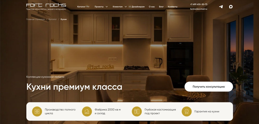
The work then moved to the inner pages of individual models. That is where it became clear how large the job would be. Each piece has its own traits: materials, configuration, decorative solutions, specifications. For a page I had to choose photographs, prepare descriptions, think through the sequence of blocks and present the information so that a person would want to study it. The pages use large images, slideshows, technical specifications, forms and custom graphics.
I wanted pages where a visitor can get to know a piece in detail, look at the details and form an idea of what custom manufacturing can do. See the section: fortrocks.ru/kukhni.

Wall panels: different products, the same design system
After the kitchens, the update of the wall panels section began. It also received an overview page and numerous inner product pages. The presentation had to be built a little differently here. Wall panels are closely tied to the architecture and the overall composition of a room. It is important to show them in an interior and to pay attention to how materials combine, to the lighting and to decorative details.
By that point there were already ready-made solutions that could be reused. The work started to move faster, and the new pages kept a shared visual style.
The completed projects section
I want to single out the pages of completed interiors. To me this is one of the most interesting parts of the FortRocks website. The company takes part in furnishing apartments and country houses and designs and makes furniture for individual rooms or for a complete fit-out. Each such project is a story of its own.
The pages were assembled from photographs, visualizations, information about materials, the work that was done and the designers. Sometimes it was a whole apartment or house, sometimes individual rooms. I wanted a visitor to be able to look through an interior in sequence, judge the details and see the real result of the company’s work. That is why a lot of attention went to compositions, slideshows and image processing.
Pages like these matter especially for a company that works with expensive custom orders. They show what the manufacturer can actually do and help a potential buyer picture the result of a future project.
A new design for the blog
Another direction was the articles section. The blog overview page and the layout of individual posts were reworked. For premium furniture, information materials matter a great deal. Buyers study technologies, materials, design solutions and the specifics of custom production.
They often do this long before they are ready to send a request. That is why I wanted the articles to be comfortable to read and well designed. Attention went to typography, page composition and the use of images. As a result the blog began to sit more naturally with the new commercial sections.
A huge amount of work with the content
One of the most labor-intensive parts of FortRocks was preparing the source materials. I noticed long ago that on a large website this work can take no less time than the layout itself. And it does not matter how responsible and engaged the client is. The company has its own production processes, staff, customers, current projects and many other tasks. Expecting it to hand over all the content as neatly named, processed files already sorted into future pages would have been naive.
At FortRocks the work was given large archives of professional photographs, video reviews, interior visualizations, technical specifications and information about designers. There really was a lot of information. It still had to be sorted, organized, checked and sometimes supplemented.
Why a single photograph can take so much work
A typical situation: the client sends a link to a folder of photographs. Inside are dozens of files with technical names, photographs from different shoots and originals of enormous size. It is not always clear at once what belongs to a particular piece.
Sometimes the details have to be clarified, other angles found, or it has to be worked out which version of an image is fit to publish. After that the photograph has to be processed, the composition adjusted if needed, and the file optimized. With a large selection, all of these steps repeat dozens of times.
Another question is how the files are transferred. Large archives stored in the cloud are not always convenient to download in big batches. Technical points like that can slow the work down seriously. I treat them as a normal part of a large project.
Photos, video and extra graphics
At FortRocks the preparation was not limited to photographs. Many pages also received extra compositions, backgrounds, teasers and illustrations. Slideshows were assembled from separate images.
Video reviews were placed on video hosts and embedded in the Tilda pages. Some photographs were stylized, with versions in different lighting. I like working with visual materials, but it really is labor-intensive, especially when one style has to hold across dozens of pages.
Zero Block and modifications of standard blocks
Technically the project turned out to be quite dense. The project uses a lot of Zero Block, because premium layouts often needed complex custom compositions. At the same time I tried, where I could, to use standard Tilda blocks as well. If the result can be reached by modifying a ready-made block, that is usually easier to maintain later.
So the project used Zero Block, CSS, JavaScript and various ways of adapting standard elements. The result combined a custom design with what the platform itself can do.
Quizzes that look like part of a premium website
The new pages gained many forms and quizzes. Visitors can use them to specify the furniture parameters they care about, choose solutions and ask for a cost estimate. Most of the quizzes are built on standard Tilda blocks. Their appearance, though, is quite different from the default. Custom graphics were prepared for the quizzes and the visual presentation was reworked so that they would match the overall FortRocks style.
For me this is a good example of how much work on the details can do. The functional base stays standard, and the user sees a complete, individually designed interface. Of course that work takes time. But the result noticeably affects the overall impression of the pages.
Why I brought in a designer
At the start the volume of tasks was so large that extra hands were needed. I invited a designer I had already worked with. He helped prepare the graphic materials and assemble new pages and blocks directly in Tilda. That made it possible to do different parts of the project in parallel and move faster through the large sections.
Over time the project built up its own library of blocks and design elements. Ready solutions appeared for typical pages, forms, graphic compositions and individual interface elements. Much of it can now be reused. A new section no longer has to be designed from scratch every time. It is enough to adapt the existing components to the specific content.
I now handle the current updates on my own. I like it when a large project gradually grows its own system of elements, which makes the later work simpler.
Working with the FortRocks team
FortRocks turned out to be a very pleasant client. The company is open to conversation, to discussing ideas and to looking for solutions together. For working with me they assigned a manager who helps collect materials, clarify information and approve pages. On a project like this, that really matters. You constantly have to understand the product, the materials, the technologies and individual completed interiors.
Of course it does not always go evenly. There are technical difficulties, delays with materials, and commercial priorities change. But this collaboration has a mutual understanding that lets working questions be settled calmly.
The project is temporarily paused right now. The economic situation makes companies look more carefully at spending, so continuing the redesign of the next sections has been postponed. I am finishing small current updates and waiting until the client is ready to move further. I would very much like, in time, to update the home page and bring the whole site to one visual style.
What changed after the new pages were published
The pleasant part is seeing real changes in how visitors behave. According to the site statistics, people began to spend considerably more time on the updated pages. Where many users used to open a page and leave almost at once, they now study the product in more detail. They look at photographs, read articles, interact with forms and go through quizzes.
The number of inquiries from the updated sections has also grown noticeably. That is an important result, although I do not want to turn it into a loud claim about sales growth without the data to support it. A fair assessment has to take traffic sources, advertising activity and other circumstances into account.
The dynamic itself shows that visitors began to interact with the site more actively. And the client likes the new design. For me that confirms that the chosen direction of the design turned out to be right.
What working with expensive furniture taught me
FortRocks was my first project with such a long cycle for the decision to buy. Here a person may spend months choosing a manufacturer. They study materials, compare offers, consult a designer, visit showrooms and clarify the cost and the terms of production. Especially when it is a complete furnishing of an apartment or a country house. A decision like that takes time.
The website therefore has to give a visitor a chance to get to know the company and the product at an unhurried pace. Detailed product pages, good photographs, completed projects and information articles become important parts of that process. There is a nuance here that I felt particularly sharply.
Even a good website does not guarantee a fast sale
A client naturally judges the collaboration first of all by sales. I understand that. But with expensive custom furniture, a long time can pass between a visit to the website and a signed contract. And a huge number of factors affect the final decision. A person may compare several companies, discuss the project with their family, change the specification, postpone the purchase or reconsider the budget.
The design of a website cannot control all of those circumstances. As a developer I can affect how well the product is presented, how convenient the interface is, what the pages contain and how people get in touch. If visitors began to spend more time on the site, study the materials and send requests more actively, that is already a meaningful result of the work that was done. After that, other people and other factors join the process. On FortRocks I saw especially clearly how important it is to separate the quality of the website from the final commercial result.
What I think about a phased redesign after FortRocks
I think updating a large live website in stages is entirely reasonable. Especially when there is no way to set aside a budget for a full build at once. You can start with the most important sections, change the design gradually and keep using the existing site at the same time.
If I am talking about how I would organize such work next time, I would pay more attention to the sequence. First, an overall design system and the home page. Then the main pages of the commercial sections. And only after that the many inner pages, completed projects, articles and other materials. The site would change more consistently, and the updated elements would not look foreign against the old design.
At FortRocks the client had different priorities. The commercially important pages had to be prepared sooner to receive advertising traffic. In that sense the chosen approach paid off: the new pages became more attractive, visitors interact with them more actively and leave inquiries more often. From the point of view of visual wholeness, though, the work is not finished.
Results and plans
At the current stage four large areas of the FortRocks website have been updated: kitchens, wall panels, completed projects and the blog. A large number of inner pages were created, graphics were prepared, photographs and video were processed, and quizzes, forms and custom Zero Block compositions were developed. In parallel a library of blocks was formed, which makes further development simpler. According to the statistics, the updated pages show higher engagement and bring more inquiries.
I do not consider the visual task closed. The project is temporarily paused: continuing the redesign of the next sections has been postponed until the client is ready to move further. In time I want to finish the visual transformation of the site, update the home page and gradually bring every section to one premium design.
FortRocks became an interesting professional experience for me. It showed how much work is hidden behind the beautiful pages of a large commercial website, and how important it is to understand deeply the business of the company you work with. It also confirmed that Tilda can carry complex multi-page projects with a custom design, if you work carefully with the structure, the content and the technical details.
See the Kitchens section: fortrocks.ru/kukhni. The company website: fortrocks.ru.
A phased redesign of a live website
If a large live website needs to be updated in parts, with the current structure kept and new pages built on Tilda, I can join that kind of task: from individual sections and graphics to forms and later support.