How it all started
The hiking school “Peshehodnik” is one of those projects where the subject itself suggests what the website should be like.
Mountains, forest trails, tents, backpacks, hiking photos. I wanted to convey that mood and, at the same time, build a convenient page where a future student can easily understand the training program.
The idea of a new website appeared after Karina Grigorieva, my colleague and a student of “Peshehodnik”, offered the school’s head Yulia Bychkova help with promotion.
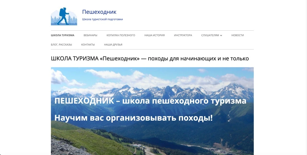
The school already had a website, peshehodnik.ru. It had been created many years earlier, so I decided to build a second version: modern, with a new structure and design.
The platform was chosen right away: Tilda. The site was to be built on it, and then filled in and improved over time.
The first mockups — and almost immediately the right concept
I like it when the visual solution grows out of the project’s subject. For a hiking school, natural colors were an obvious choice.
Blue and green became the main ones — the shades of the sky, the forest and mountain landscapes. For the composition I chose a simple poster style: large headings, expressive photos, clear shapes and a minimum of unnecessary decoration.
The first mockups were made in Claude Design. The design system was started there as well, to define in advance how typical elements look and how the page behaves on different screens.
And then something pleasant happened: from the very first iterations the concept turned out exactly as I had pictured it.
Usually the design stage involves several serious revisions. Here I could move on to details almost at once. I refined spacing, element sizes and the composition of individual screens, but kept the overall direction.
This proved especially useful later, when the site began to quickly gain new blocks.
Building on Tilda. And the landing page starts to grow
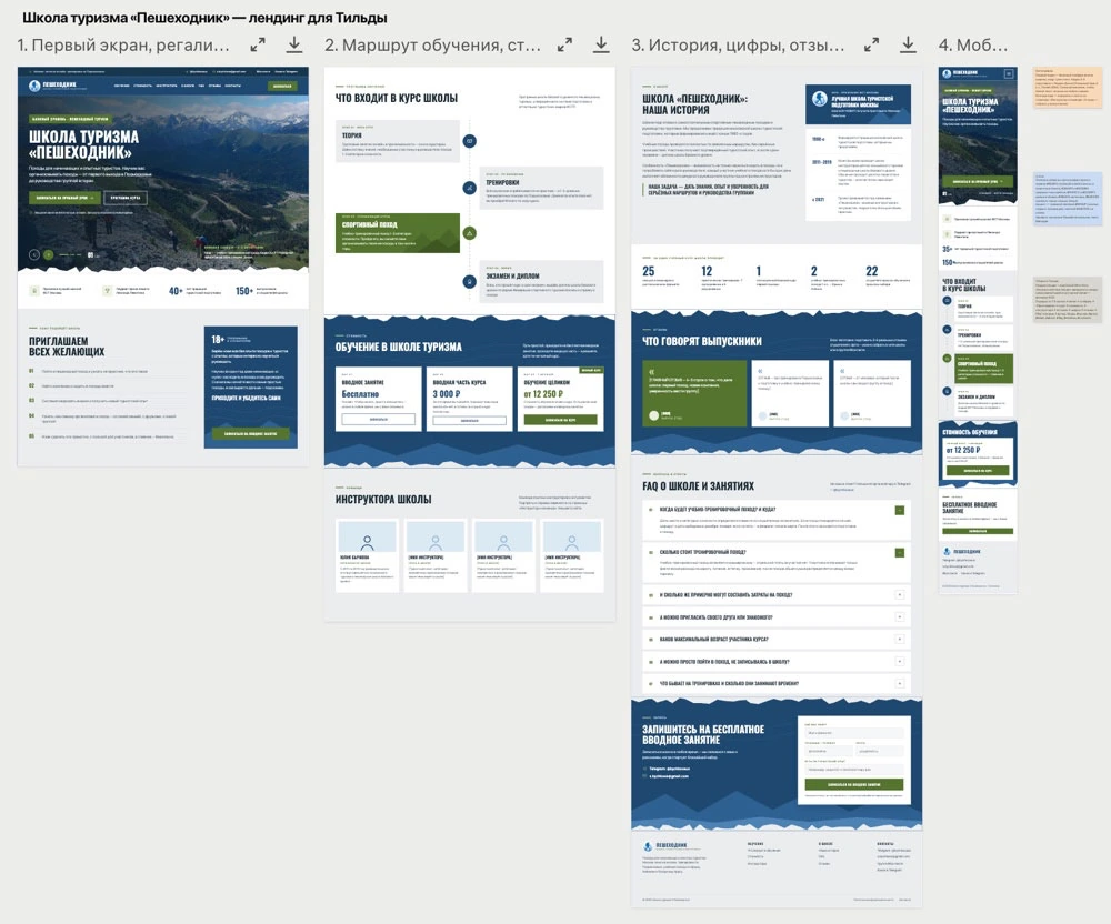
After the concept was approved, I rebuilt the mockups and assembled the site on Tilda.
At the start I planned an ordinary landing page. But the deeper I went into the school’s materials, the clearer it became that I could not tell everything in a few screens.
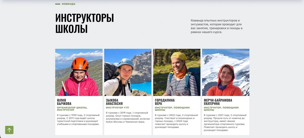
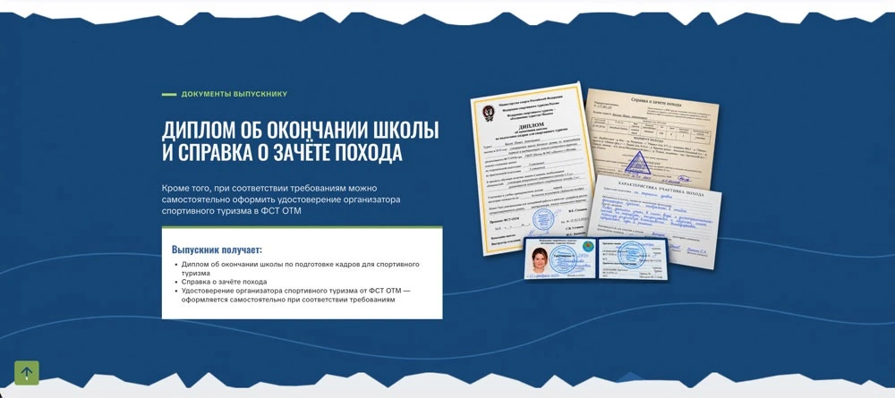
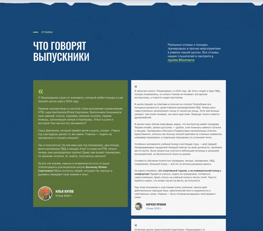
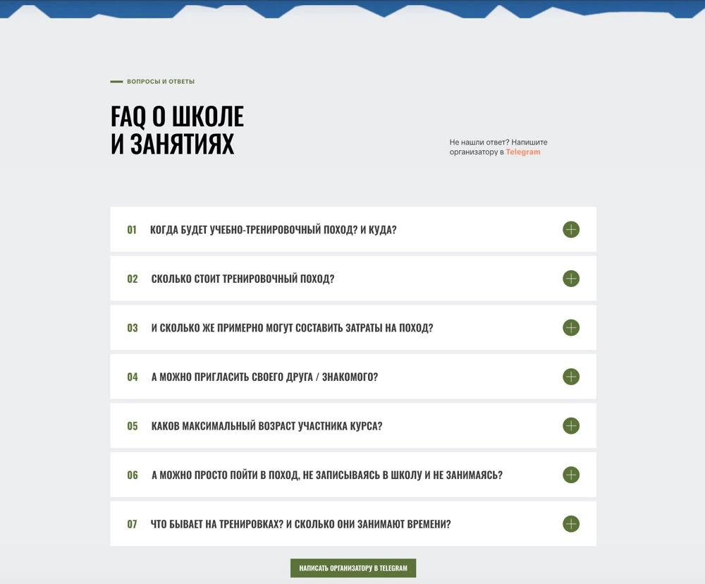
“Peshehodnik” has a large training program, an interesting history, qualified instructors, diplomas and awards, graduate reviews, photos from hikes and plenty of questions that beginners ask.
I wanted to find a suitable place for each of these materials.
So the landing page gradually turned into a large one-page site with dozens of meaningful and visual elements.
It was especially important to keep the rhythm: alternating text blocks with photos, cards and galleries without overloading the visitor with information.
The design system came in very handy here. Instead of inventing the styling anew each time, I could use the approaches already chosen and adapt them to new tasks.
How I structured the training program
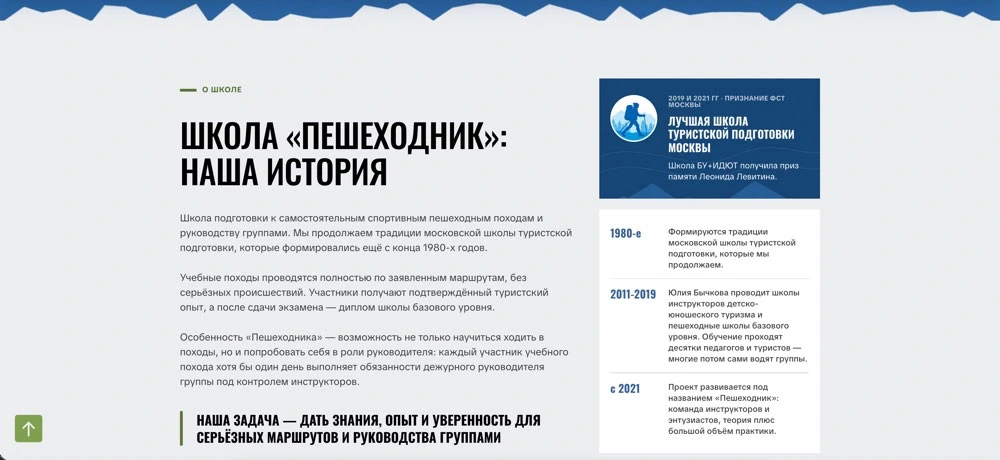
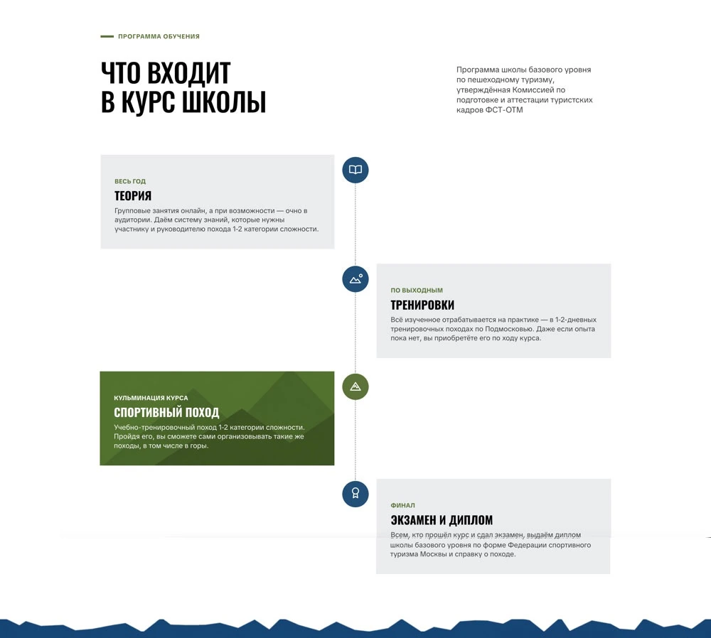
One of the main sections is devoted to the training itself.
The school runs online classes, field training and training hikes. There is a first aid course and a final assessment.
I wanted the program to be easy to read. A person who is thinking about hiking training for the first time should see what they will learn and which classes await them.
So the information was divided into clear blocks, with the emphasis on the content of each area.
During revisions an interesting nuance came up. The numbering of the program’s parts gave the impression that you must fully complete one stage before the next, and so on. In practice, some classes run in parallel.
I removed the numbers and clarified the wording. A small change, but now the page describes the real learning process more accurately.
A carousel of sixteen awards
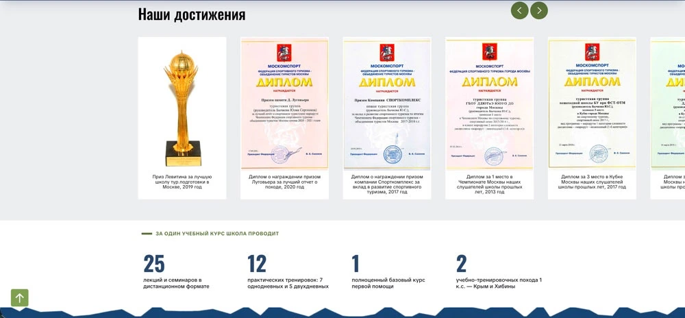
The school has accumulated quite a few diplomas and prizes. A section called “Our achievements” was set aside for them.
At first the block had a single photo, and then I expanded it into a carousel of 16 images with captions.
I wanted to keep a balance: the diplomas should be large enough to be read, but the gallery should not take up too much space.
I chose the card sizes and styling, agreed on the captions and built the carousel into the existing design.
The result is a separate visual block that shows the school’s achievements and makes the page more varied.
The enrollment form: even small things matter
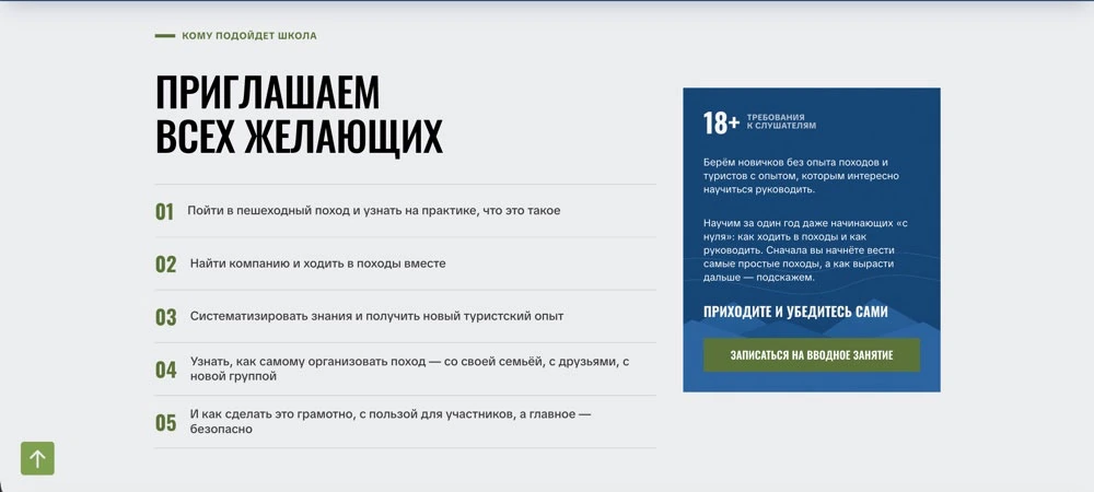
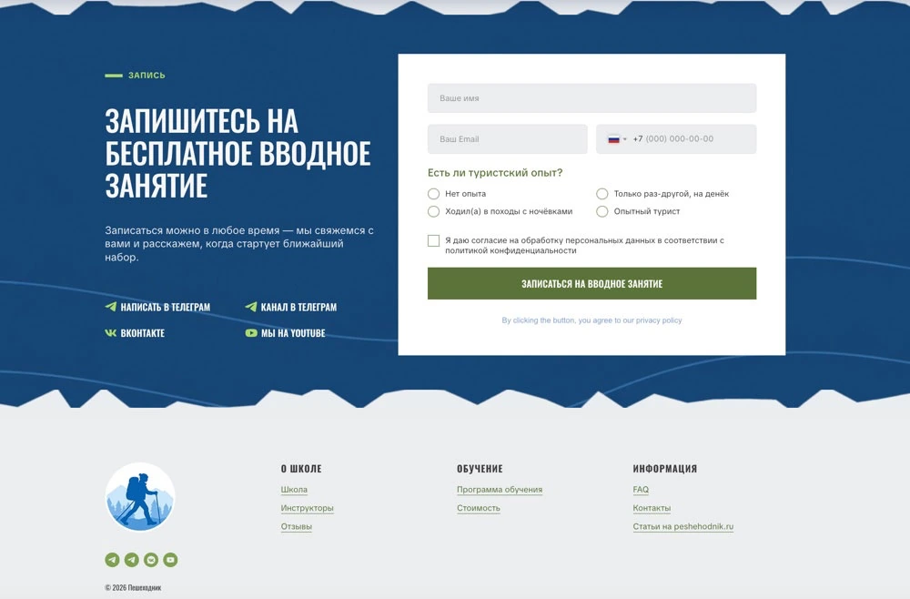
For course enrollment I built a multi-step quiz that opens over the page in a modal window.
In it a future student can enter their contact details and describe their hiking experience.
The form was designed in the site’s overall style: the same colors, fonts and styling principles.
But the most interesting thing, as often happens, came up during testing.
One of the questions had an “Other” option that was meant to let people type their own answer. However, the form switched to the next step automatically right after an option was selected. The visitor simply had no time to write anything.
I turned the automatic transition off. Now people decide for themselves when to continue.
I also added mandatory consent to personal data processing with a link to the relevant document.
Such details are rarely visible in screenshots. But they are what determines how convenient the finished site is to use.
Cards, buttons and the mobile version
Once the main sections were ready, the work on details began.
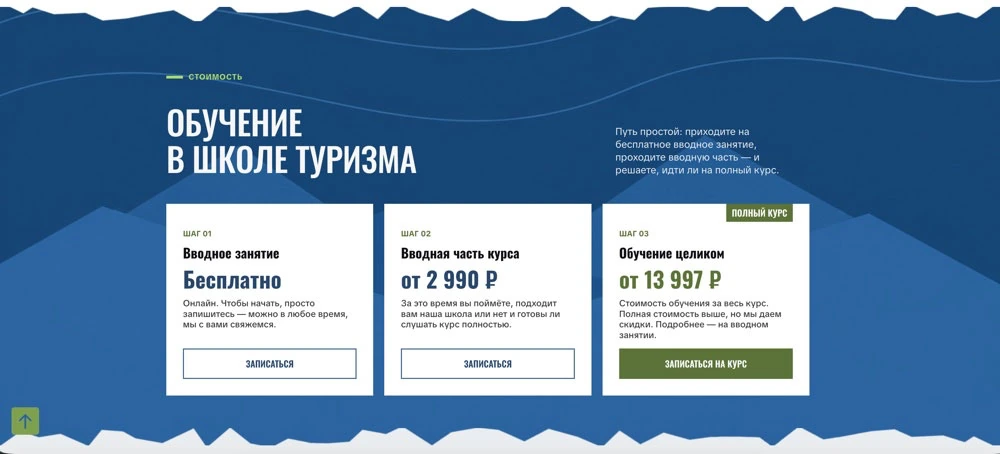
For example, the pricing cards looked neat at first glance, but because of the different amounts of text the buttons sat at different heights. I had to change the layout: put the main information at the top and align the buttons to the bottom edge.
After that I checked the block at five screen sizes: 1440, 1100, 800, 560 and 375 pixels.
Separately, I went through the buttons across the whole site. Some links turned out to be wrong, and some elements differed in size and font weight.
I took the button in the header as the model and brought the rest to a single style.
I checked links, spacing, the placement of elements and how the page behaves on mobile devices.
On a large landing page this kind of work takes a lot of attention. When one page has many different blocks, it is important that they all look consistent.
And then the revisions began. A lot of revisions
After the site was built, the work continued together with the school’s head, Yulia Bychkova.
Yulia studied the page carefully, clarified the content and suggested changes and new materials. Sometimes the comments concerned the text, sometimes the styling, buttons, structure or individual details of the program.
Once she sent a screen recording of almost 23 minutes with voice comments.
In such recordings people usually think aloud as they watch: they suggest something, then clarify, change their mind, remember one more detail. Going through all this by hand without missing anything can be hard.
I used automatic transcription and video analysis tools. The result was a list of 21 items with timestamps. Debatable points were set aside separately for clarification.
After approval, the changes were made directly in Tilda. For some tasks I used Claude Code and Codex connected to the project via MCP.
Speed is especially handy in this process: you can hand over a large list of revisions and work through it step by step. If the client changes their mind later, making the correction becomes an ordinary part of the work.
Of course, I check everything after automatic changes. Sometimes spacing, styling or the behavior of an element needs adjusting. But working with a large number of clarifications has become much calmer and faster.
What is still done by hand
In the work on “Peshehodnik”, as in other projects, graphics still take a significant amount of time.
Preparing an image, getting the right composition, choosing a color, fixing details and optimizing the file is often easier with familiar graphic tools.
So I use Figma, ChatGPT and Photoshop depending on the task. Some concepts are created with AI, some are refined by hand, and the finished images are optimized and placed on the site.
On the other hand, work with texts, formatting, responsiveness and numerous small improvements has become noticeably faster.
What matters to me is the outcome: the site should look tidy, work correctly and match the chosen concept.
The result
The new “Peshehodnik” website is now live at shkola-peshehodnik.ru.
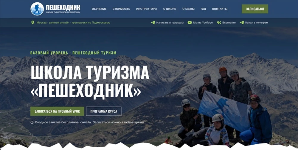
The result is a large landing page with a natural palette, expressive photos, a detailed program, information about the instructors, a gallery of awards, reviews and an enrollment form.
It is especially pleasing that the design hardly had to change from the first mockups. I steadily developed the approved concept, and even the new blocks fitted naturally into the page.
Yulia Bychkova liked the site. She continues to take part in filling it in, and I am finishing the remaining details.
The project has a big sequel
The last settings are now being completed before the advertising campaign starts. I will be able to assess the results of paid ads and SEO later, and plan to cover them in a separate case study.
The site itself will keep growing, too.
The school has many photos, videos and stories from hikes. The plans include articles, reports, guides, useful materials for beginner hikers and its own encyclopedia.
Perhaps in time the large landing page will turn into a full multi-page website.
There is one more idea: a Telegram Mini App for the school. I still have to work out which features will really be useful to students, graduates and hike participants.
For now, “Peshehodnik” is a good example of how a successful visual concept can grow into a large, living Tilda website that is easy to develop together with the client.
A Tilda website for your project’s goals
If you need a website with a well-thought-out design, non-standard blocks and room for regular improvements, I can build it on Tilda and support it as the project develops.