The project that wouldn’t leave me alone
Some projects you want to come back to. They work, the client uses them, but you know the result could have been much better. For a long time, ProCoffee was exactly that for me — a website for renting professional coffee machines. Three years after the first build, I finally got the chance to redo it on Tilda. And now I am genuinely happy with the result.
My acquaintance with ProCoffee began several years ago. Back then I was building two projects for the client on 1C-Bitrix at once: a professional coffee machine rental website and a large online store for coffee equipment. It was a big job that took about six months.
I was responsible for project management, design, layout, visual materials and coordinating development. The programming was done by a Bitrix specialist brought in for the project. At the same time the sites were being promoted, so I had to take SEO into account, set up the relevant modules and agree on technical changes.
It was not an easy experience. Remote work with several participants required constant coordination. Some questions could not be solved without involving the programmer, and response times did not always match the pace I wanted to keep.
But the reason I was unhappy with the result went far beyond organizational difficulties.
How I customized a ThemeForest template for Bitrix
At that point the project had limits on budget and time. So instead of a custom design and separate layout development, the client and I decided to use a ready-made template.
We bought it on ThemeForest. What is more, the template was from the WordPress category, while the site itself was built on 1C-Bitrix.
I have a lot of HTML layout experience, so I did the adaptation myself. I changed the styling, reworked blocks, fitted elements to the project structure, adjusted styles and the placement of individual components. This kind of work is called template customization.
And it was on this project that I felt especially clearly how debatable such an approach can be.
A ready-made template often looks quite harmonious in its original form. It was created as a single system in which the authors thought through in advance how elements, spacing, styling and interface behavior fit together. But when you start changing a large part of that system, the original logic gradually breaks down.
One change requires another. Extra styles appear, workarounds, the need to constantly account for the code that already exists.
At some point the question arises: wouldn’t it have been easier to order a custom design and develop the layout specifically for this project from the start? Today I think that in our case that option could have worked better.
Did adapting the template affect the site’s speed? I can’t rule it out. Since the template was originally meant for another platform and was reworked quite heavily, the project could have been left with extra styles, scripts or other redundant elements.
But that is only an assumption. I did not run a separate technical audit of the old version that would let me pinpoint the causes of the poor performance. So I won’t claim it was the template or the way it was adapted. The causes may have been several factors at once.
Under those conditions I did the most I could. The site launched, the client used it, promotion went on. But personally, I was left with a feeling of something unfinished.
Why, after more than ten Bitrix projects, I started looking for another platform
For many years I built websites mostly on 1C-Bitrix. Over that time I delivered more than a dozen projects and got to know both the platform’s capabilities and how development is organized around it.
I consider Bitrix itself a serious system with its own area of use. But gradually I was increasingly bothered by depending on other specialists.
The problem was not that programmers work badly. Many of them are excellent professionals. The difficulty lay in how the process itself is organized.
Many people who build websites have probably run into a similar situation. At the start of a project a team comes together. Everyone has time, interest and a shared plan. But closer to the end, things begin to change.
The specialists involved get new projects, priorities and workload shift. Small changes become harder to make, approvals take longer. And after the site is handed over, the original contractor may stop taking part in its support altogether. That is quite understandable: the person has other commitments and cannot stay available forever for every finished project.
But for the person answerable to the client for the result, it becomes a serious problem. You urgently need to make a change, fix a feature or eliminate a bug, and the specialist who wrote that part of the code is unavailable.
Then you have to find another developer. The new person sees the project for the first time. They need to understand the architecture, study the existing code and work out which decisions were made earlier and why. That takes time. Sometimes a lot of it. Extra costs appear, deadlines slip, and the client quite fairly expects the site to keep working and developing.
I faced such situations many times and gradually realized I wanted to change the approach itself. I needed more independence: the ability to implement most features myself, make changes and support the site without building a new chain of approvals every time.
Why Tilda
Gradually I began working with Tilda more and more. At first I was drawn by the simplicity of development and the convenience of the visual editor. But over time much more interesting possibilities opened up.
Standard blocks can be modified. With CSS and JavaScript you can change how elements look and behave, build non-standard interfaces and extend functionality. At the same time, most of the site stays manageable through the familiar admin panel.
My layout experience turned out to be very useful here. I could design pages myself, write styles and scripts, adapt standard blocks and solve technical issues. Gradually Tilda became my main development platform.
That does not mean absolutely any project can or should be built on it. But for the class of commercial websites I work with most often, it gave me exactly the independence I had been missing. And ProCoffee became one of the projects where the advantages of this approach showed especially well.
Three years later, I suggested redoing everything
By then Tilda’s capabilities already allowed building a professional equipment catalog with filtering, separate model pages and the necessary commercial functions. I had also gained experience building multi-page websites and online stores with custom modifications.
So I suggested that the client move ProCoffee from Bitrix to Tilda. I wanted to solve several things at once. First, improve the site’s speed. Second, make ongoing support simpler. Third, finally bring the design and the technical implementation to a level I am happy with.
The client agreed, and we started on the new version.
A careful redesign: when the client likes the old site
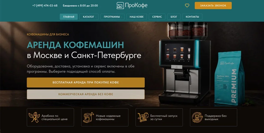
An interesting moment came up here. Despite my critical view of the previous version, the client liked its design. Over several years the site had become familiar. The color palette, the icons and some styling elements were seen as part of the brand identity.
So I did not change the visual concept completely. I kept the main palette and some characteristic elements, but made the styling calmer. In my view the old site was a bit too bright. I wanted to reduce visual overload, bring the blocks into a more unified system and place the accents more carefully.
The result was a careful redesign. The look changed, but ProCoffee stayed recognizable. I like this approach: respect the client’s preferences and the history of an already working project while improving its design.
A month and a half instead of six
The original development of two sites on Bitrix took about six months. We built, filled and launched the new ProCoffee version on Tilda in about a month and a half.
Of course, comparing these timelines directly would not be fair. With the rebuild we already had the structure, ready content and an understanding of the business. But the difference in the process itself turned out to be huge.
I could solve most questions on my own. There was no need to agree every change with a separate programmer, wait for a chance to make a small edit or explain the project’s specifics again. That is exactly what I was after when I started looking for an alternative to the old way of working.
How I migrated the site and what happened to SEO
During the migration it was important to keep the existing structure as much as possible. ProCoffee had been promoted in search engines for several years. The site had indexed sections, equipment cards and informational pages.
So I tried to keep the old URLs wherever possible. If a page address changed, we set up a 301 redirect right away. The switch itself went quickly, with no long interruption to the site.
But search positions turned out to be more complicated. After the migration, ProCoffee lost part of its positions in search results, despite the preserved structure and the configured redirects. I don’t want to pretend this didn’t happen.
A change of platform always affects the technical side of a site. The HTML markup changes, the way pages are generated, some elements of the internal structure and other parameters. All of this can influence search engines. Which factor was decisive in our case cannot be said without additional analysis.
We are continuing the SEO promotion of ProCoffee, and restoring the previous positions remains one of the main tasks. For me, it is part of the further work on the project.
The coffee machine catalog: Tilda pleasantly surprised me here
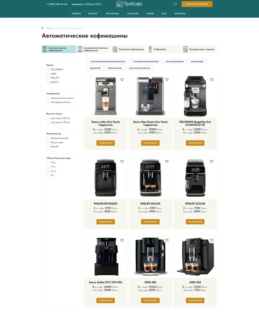
The catalog is one of the most important parts of ProCoffee. The site presents professional automatic, super-automatic and portafilter coffee machines, as well as coffee grinders. The equipment is expensive and has many specifications, so it is important that a visitor can quickly find a suitable model.
To build the catalog I used Tilda’s built-in “Product catalog” module. It let me implement the display of cards, equipment previews and filtering on section pages.
I set up a separate set of filters for each category. For example, the characteristics that matter when choosing a portafilter machine can differ greatly from the parameters of super-automatic equipment. The filters are in the left column and let visitors pick models by the criteria they need.
Most of the functionality was achieved with Tilda’s standard tools. And where the platform’s capabilities fell short, I used my own modifications.
SEO landing pages: finally done the way I wanted
On the previous site we tried to build a system of thematic SEO landing pages with a Bitrix module. But I couldn’t implement it the way I needed back then. On Tilda the task turned out to be much simpler.
The principle is as follows. We take a certain equipment category, form a selection by the required criteria, create a separate page with a human-readable URL and add SEO-optimized text.
For example, ProCoffee has a page of automatic coffee machines for beauty salons: procoffee.pro/catalog/avtomaticheskie/dlya-salona-krasoty. It shows the equipment for that use case.
I placed links to such pages as a cloud on the main catalog section pages. Each category has its own group of thematic landing pages. To output the links the way I needed, I had to modify Tilda’s standard blocks. But as a result I got exactly the structure I wanted.
The manufacturers section works on a similar principle. Each brand page contains the equipment of a specific make, lets visitors filter models further by specifications and includes SEO-optimized text.
This way the catalog can grow by categories, brands and different use cases. I like that this architecture lets the site expand gradually without constantly changing its foundation.
Equipment cards and two rental programs
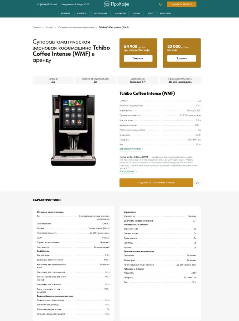
Over the years of building catalogs and online stores on Tilda, I developed my own approach to product cards. I try to make them as informative and convenient as possible for a potential client. This matters especially for expensive professional equipment.
A person should understand what a specific coffee machine is, what its specifications are, what use it suits and on what terms it can be obtained. So when building the cards I paid attention to the structure of information, descriptions, specifications and commercial elements.
The project also has its own feature — two rental programs. A visitor can choose commercial rental with a fixed fee, or rental on condition of buying a certain amount of coffee. I decided to show both options right in the equipment card.
One button shows the cost of commercial rental. The other shows the amount of coffee that must be bought under the corresponding program. Each button opens its own request form. The scenario is convenient: a person studies the coffee machine, sees the terms and can immediately send a request for the chosen option.
A separate section of the site is devoted to a detailed comparison of the rental programs.
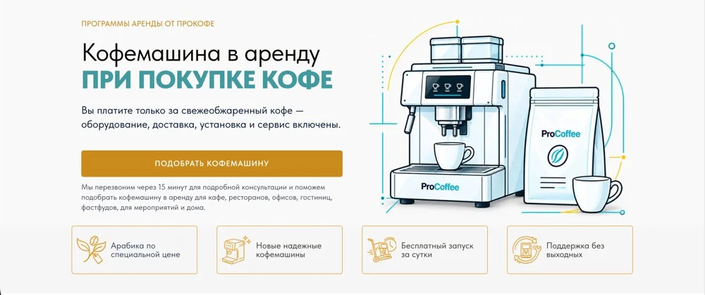
In the future I want to add automatic generation of a commercial offer to the cards. A visitor will be able to download a document with information about a specific model to their computer. For now this feature is in the plans.
ProCoffee is much more than a rental catalog
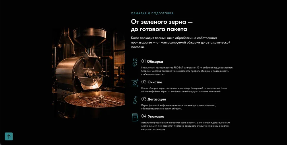
The site has several additional sections. One is devoted to servicing and repairing professional coffee equipment. Another is about the company’s own-roast coffee from Brazil, which it offers to clients. Detailed terms of the rental programs are presented separately.
All these directions had to be combined into a clear structure, so that a visitor could easily move from choosing a coffee machine to studying the terms of cooperation and additional services. It matters to me that a multi-page site feels like a single system, even when it presents different areas of the business.


A blog we keep developing
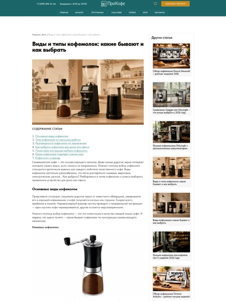
Another important part of ProCoffee is the blog. We work on its content regularly: we prepare long articles, analytical pieces and reviews of professional coffee machines. I like in-depth publications with illustrations, a thorough treatment of the topic and a clear structure.
In the articles we use internal links to specific equipment models. This lets the reader move from studying the material to the matching card in the catalog. The blog also helps expand the informational part of the site and work with search queries related to choosing and using professional equipment.
The main impression after launch: the site is finally fast
When I first opened the new ProCoffee version, it was a pleasure in itself. After the previous site, where I sometimes had to stare at an animated loading icon for a long time, the difference was felt immediately. The new Tilda version works noticeably faster.
I did not run a separate comparative test recording figures before and after, so I won’t quote made-up percentages of improvement. But in daily work the difference is truly significant.
And what is especially pleasing — the client is happy with the result too. Now I can make changes myself, work with the catalog, develop landing pages and handle the design without constantly bringing in a separate specialist for every change. That is exactly the independence I was missing for a long time.
A redesign the client didn’t have to pay for separately
There is one more detail I particularly want to mention. We redid ProCoffee within the existing monthly fee for information support and promotion. That is, the client did not have to pay extra for developing the new version.
On my side this was a deliberate decision. I had long wanted to return to the project and fix what I was unhappy with in the previous implementation. At last there was a technical way to do everything differently and, at the same time, make further support much simpler. In a way, it really was closing a long-standing unfinished matter. Now, when I open ProCoffee, I see a site whose result I am happy with.
What I want to build next
We are continuing the information support and SEO promotion of ProCoffee. One of the priority tasks is restoring search positions after the change of platform.
In parallel we plan to add video reviews to the equipment cards. We expect the materials for them from the client’s marketing department. I also want to implement automatic generation of commercial offers for specific coffee machines.
But there is also a bigger idea. We are discussing an app that would extend the existing site. Clients need personal accounts with different user roles and matching access rights.
For now we are at the stage of gathering requirements and working out use cases. We are considering a Telegram Mini App and a PWA. We will choose the technology only after defining the required functionality and the ways to integrate with the site.
This is exactly the kind of framing that interests me: first work out what users really need, and only then choose the technical implementation. It will be quite a complex project, so I don’t want to rush architectural decisions.
What I took from this story
ProCoffee became a project I managed to return to with new experience and different technical possibilities.
The first build on Bitrix was not easy. We worked on a limited budget, used a ThemeForest template meant for WordPress, adapted it to another platform and customized a lot. Back then I did everything I could in the given circumstances, but the result stayed far from what I wanted.
Three years later I was able to rethink the approach. In a month and a half we moved the site to Tilda, carefully updated the design, kept the main structure, and built a convenient catalog, filtering and SEO landing pages. The site became noticeably faster, and working with it is now much more convenient.
Of course, tasks remain. Restoring search positions, developing content, new features and the future app are all still ahead. But now the project has a technical foundation that I am comfortable working with and that is interesting to develop. And most importantly, I am finally happy with the result.
See ProCoffee: procoffee.pro.
Moving a site to Tilda without losing its structure
If your site has become slow and hard to maintain, I can move it to Tilda keeping the addresses and redirects, carefully update the design and set up the catalog and SEO pages.