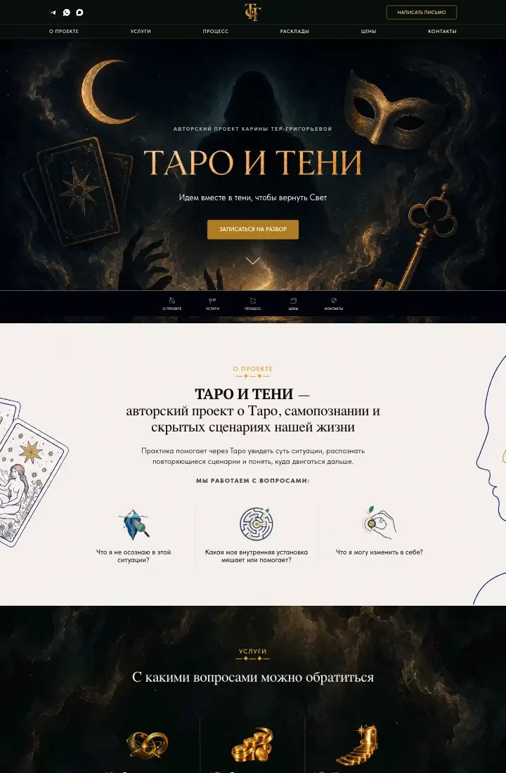
Sometimes launching a new project only takes one well-thought-out page. That is how the story of “Taro i Teni” began — the author project of practicing psychologist Karina Ter-Grigoryeva, focused on consultations using Tarot cards. I built the site on Tilda in about two weeks, and a couple of months later continued with a Telegram app that catalogs the cards and their meanings.
How the project started
The idea for “Taro i Teni” came from my long-term client, practicing psychologist Karina Ter-Grigoryeva.
In her practice, working with metaphors and images plays a large role. Among the approaches she uses are metaphorical associative cards and other practices that involve the client’s inner experience.
Her interest in Tarot has grown over many years of study, training with experienced specialists and hands-on use of the cards.
Over time, she wanted to present this direction as its own offering. That is how “Taro i Teni” appeared, and it needed a dedicated website.
Visitors should be able to learn about the consultations on offer and choose how they want to engage — whether a standalone Tarot session or, later, deeper psychological work.
It was important to keep both directions clearly separate and explain what kind of request each visitor can bring.
Why we started with a landing page
At the first stage the project had no large archive of materials, dozens of services or a need for complex site structure.
Still, the goal to go live was concrete: present the new practice direction, explain consultation formats and let potential clients reach the specialist.
So we chose a one-page site.
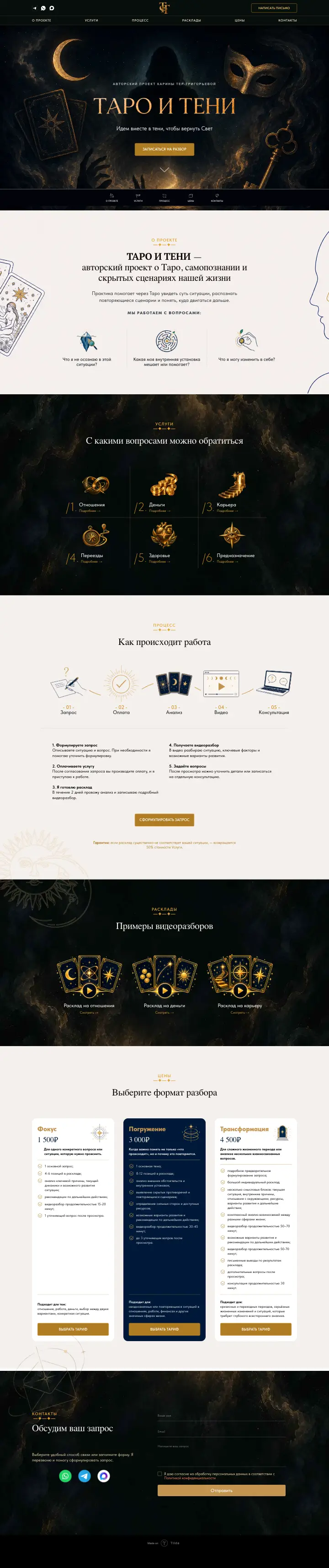
The client listed the sections she wanted on the page. I turned that into a clear flow: introduction, consultation types, how sessions work, pricing and contacts.
A landing keeps essentials in one place so visitors do not hop between pages to understand services and how to get in touch.
A small first version does not mean the project stays small forever. During development I left room for future content, including blocks for demo video readings that can be switched on as videos are ready.
Articles, reflections, case notes from practice and a Tarot card reference are on the roadmap — so the first version could ship without waiting for every future asset.
Design: dark palette, gold and a touch of mystique
Tarot has a recognizable visual language: dark tones, symbolism, deep blues, gold accents. I kept those associations and built a custom look on top of them.
The base is a dark scheme with deep blue and gold. That sets the mood and ties the page to the project theme.
We did not use an off-the-shelf template. The layout was designed individually; I used ChatGPT for some visual elements.
The art should not get in the way of reading. With strong graphics already on the page, heavy animation and constant motion would be too much.
Visitors need a calm path to services, consultation copy and choosing a format.
Why the site is on Tilda
We picked the platform for how the client plans to maintain the site after launch: she expects to update copy, add materials and grow the project herself, without calling me for every edit.
Tilda fits that workflow. With a sensible block structure, the owner can change texts and images in the visual editor.
I combined standard blocks and Zero Block — standards for repeatable parts, Zero for precise composition and custom design. I also extended default styling where needed.
I have worked with Tilda for a long time and know how far you can push it beyond default templates. The trade-off: the more custom code is baked into the page, the harder ongoing edits can become.
Here I avoided HTML fragments with their own logic so the client can keep editing comfortably.
The site is responsive across five breakpoints, with layout, type and graphics tuned for small screens.
Development without long approval cycles
The project shipped in about two weeks. Long-standing collaboration helped: when client and developer understand each other, decisions move faster and there are fewer intermediate approval rounds.
There were no major technical blockers and no repeated concept pivots. I handled design, visuals, the Tilda build, responsive work and QA myself — no separate design, front-end or content team.
That kept the visual direction coherent and got the site live quickly.
What came next: Telegram Mini App
About two months after the landing, the next digital product appeared — the “Taro i Teni” Telegram Mini App.
The landing presents the practice and paid consultations; the app adds an in-messenger reference of Tarot cards and their meanings.
The landing still anchors the project for new visitors; the app adds reference content. I describe the Mini App build in a separate case study.
Outcome and what is next
The first goal is met: “Taro i Teni” has its own site with custom design, consultation descriptions, pricing and a way to contact the specialist.
The platform lets the client maintain content herself. Sections for future video are prepared; expanding the informational part stays on the roadmap.
Promotion is next. Once campaigns run and data accumulates, we can judge traffic, behavior and real inquiries — and decide what to develop further.
See the project: taroiteni.ru.
A Tilda landing for your project
If you need a one-page site with custom design, clear structure and room to grow, I can build it on Tilda and support it as the project evolves.